In the spring
of 2015 I created a set of Halloween themed pieces as submissions to a
fiction print anthology focusing on Halloween. The
anthology was set for a juvenile reading level. I toned down my usual
gore and darkness and tried to shift my imagery a little towards the
lighter side. You will see as the pieces progress that the darkness
began creeping through regardless. Although my submissions
were rejected, I ended up with six lovely pieces that I will be sharing
between now and All Hallow's Eve. I hope you enjoy them.
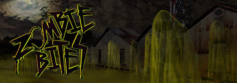
For this piece I wanted to create an uncomplicated image. I wanted the image to be mostly darkness to focus on the ghostly glow. I did not want any details to be lost in the darkness so I adopted a clean and simple style.
{8x5.33, created in Adobe Photoshop}
With this header, I wanted to evoke a creepy foreboding without any direct confrontational horror. The monstrous thing is far away, but it's big and could be close in heartbeat, especially if it should NOTICE you. eep. ...and worse, there is more than one.
For
2015, I wanted to take the headers in a different direction than the
work I had been producing. I chose to adopt a looser style. Although the 2014 pieces all had some underlying element of
dark humor or social commentary, the 2015 headers have all moved back
towards the essence of the work I want to create: horror.


