Showing posts with label Drawing. Show all posts

Sunday, September 16, 2018

Happy Birthday Mike Mignola

Mike Mignola has been one of my favorite artists since I first picked up the Rocket Raccoon, Incredible Hulk, and Alpha Flight issues he drew in the early Eighties.  His work has a mystique and mystery that no one else was creating at that time or in my opinion, since.  His style has changed much from his early eighties work with his later work at DC Comics, the Bram Stoker's Dracula adaptation,  and the advent of Hellboy.  I have enjoyed the journey through every stylistic iteration of his art.

His work has been hugely influential upon my artistic style and process.  I send this out in thanks for the literal years of entertainment and joy I've received from his work.  Thank you Mr. Mignola and Happy Birthday!

{8x5.33,  created in Adobe Photoshop}


Wednesday, May 06, 2015

From the Archives: The Horde of July


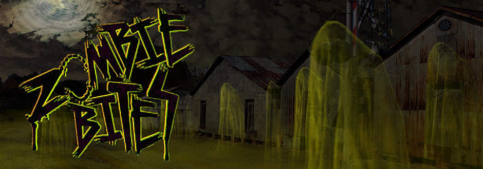
Here we have the Zombie Bites header from July 2014, The Horde of July. As the zombie infection spread, all armed forces were called upon to defend the human race.  In the end, the soldiers were overwhelmed and reanimated as more mutilated hosts.  In the sweltering heat of summer the horde seeks out those it once sought to protect.  The horde hungers.

~

During 2014, I began creating a new header each month depicting a scene associated with the dominate holiday for that month but with a zombie twist.  I'll be posting the headers here in From the Archives to give them a nice dark corner to fester in.  I'll also be posting the images with and without the logo so you can see the parts of the background image that were covered by the logo.  Thanks for viewing and reading! 

I apologize that I am unable to post the header without the logo.  I had a computer crash back in August of 2014 and lost access to some of my files and data.  I do not currently have access to the logo-less version of this image, but as soon as I do, I will post it here. 

If you like what you see here, be sure to check out Valentine's Day, Saint Patrick's Day, Easter, Mother's Day, and Father's Day.

{8x2.81,  created in Adobe Photoshop}

Wednesday, April 15, 2015

From the Archives: Father's Day


Here we have the Zombie Bites header from the month of June 2014, Father's Day.  Who knows what happened outside to cause the cook out to go horribly awry.  What dread horror in the backyard made Daddy this way?  Mother and child are safe and hiding within the house, but for how long?  Daddy sure looks hungry.

I apologize that I am unable to post the header without the logo.  I had a computer crash back in August of 2014 and lost access to some of my files and data.  I do not currently have access to the logo-less version of this image, but as soon as I do, I will post it here.

~

During 2014, I began creating a new header each month depicting a scene associated with the dominate holiday for that month but with a zombie twist.  I'll be posting the headers here in From the Archives to give them a nice dark corner to fester in.  I'll also be posting the images with and without the logo so you can see the parts of the background image that were covered by the logo.  Thanks for viewing and reading!

If you like what you see here, be sure to check out Valentine's Day, Saint Patrick's Day, Easter, and Mother's Day.

{8x2.81,  created in Adobe Photoshop}

Sunday, April 29, 2012

UPDATE Sketchbook Archives: Scream

Another of the Rescans.  When I glanced at this rescan, I didn't think there was much change between this one and the original, but once I saw the two together, there is a definite improvement!  Please check out the old post and compare.

Sunday, December 11, 2011

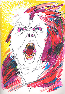
From the Sketchbook Archives: Scream

Looking back, I think this may be an indirect portrait of someone unpleasant I was working with at the time.  Anger and Sharpies - cheaper than therapy I guess.

Recommended Listening:
The Prodigy
Omen
Invaders Must Die

{Sharpie}

 UPDATE:

Wow.  Initially I didn't there was much change between these two, but looking at them side by side I can a severe blur and glare within the original.  The scan turned all the colors up a notch or two as well.  I cannot say it enough - Hooray for scanner!  Hmmmm...my scanner needs a name...I'll get on that.  :-)

Wednesday, November 30, 2011

From the Sketchbook Archives: In the Darkness

This is me pushing Sharpies again.  Sadly in the middle of this piece my Teal Sharpie ran out. I had to mix it with yellow and light green.

This one had to be tweaked a bit to get it to show correctly.  I don’t have access to a scanner right now, but I do have a digital camera.  I discovered that the flash reflects quite nicely off of heavy sharpie works.  UGH.  This piece and several others had to be worked over in Photoshop to get them even close to the originals.  When I have access to a scanner again, I will properly re-scan these.

{Sharpie}

UPDATE:  Fresh scan from my new scanner as of 01.28.12.  No glare in the fresh one and no needful Photoshop retouch.  The actual color of the physical piece is somewhere between these two.

Friday, November 18, 2011

Suicide Set Part III: Blame


Sister of guilt and father of shame, blame is the negative spotlight eye of God.  There is nowhere to hide.  Blame makes it impossible to move for fear of suffering and sorrow. Blame is the fire of torture now turned to self immolation.  The hand that burns me now is my own.  Blame is the self fulfilling prophecy of "it is all my fault." All of it. If it wasn't my fault before, after blame is finished, it will be.

I would like to note on the side of safety and communication that today, despite the difficulty of my current set of life circumstances, that I do not in any way feel suicidal.  It is simply that the time has come to share these pieces.

{Sharpie}

Wednesday, November 16, 2011

Suicide Set Part I: Panic


In Mid-November of 1998 I attempted suicide by swallowing a bottle of muscle relaxers.  My life at the time felt completely out of my control and I felt myself sliding into darkness, but I felt powerless to stop it. I created the drawings in the suicide set just before my attempt.  I don’t remember drawing these pieces.  Looking at them now I realize that they are based on the four elements, but at the time I don’t recall intentionally directing them that way.  I was drawing more out of emotional desperation than any kind of intent.

Panic addresses my inability to communicate.  No matter how hard I tried, it seemed that my ability to verbalize my needs was stifled and choked.  The air was running out and I think I knew on some deep level that I was running out of time.  That the opportunity to fight back was quickly evaporating.  I was sliding into the final darkness and felt I had no way to stop the descent.  I felt completely powerless.

I really only understand any of this after analyzing in the years following.  During the event I felt removed from myself.  The month preceding my attempt, I felt like I was on auto pilot.  A ghost robot of myself set for self destruct.

I would like to note on the side of safety and communication that today, despite the difficulty of my current set of life circumstances, that I do not in any way feel suicidal.  It is simply that the time has come to share these pieces.

{Sharpie}

Thursday, July 07, 2011

From the Archives: Graveyard Study

This is a study I did for another piece I was working on.  Sadly the full piece was never finished.  There may still be hope for that one yet, so I won't give anymore details as I want it to be a bit of a surprise if I do pull it off.  Regardless though, I am a bit enamored of this quiet aged graveyard scene.

A brief and tiny hurrah - this is a new record for me:  This post makes 30 posts this year.  This is the greatest number of posts I've done in any given year since I started my blog.  I know it's not much, but I'm looking at it as the beginning of something good.  :-)  My goal is to post a minimum of two posts every week, more if I can manage it.  Time will tell.  I know this is a mediocre achievement, but this is the first year I've taken my blog and truly pushed it.  Thanks for reading so far.  I hope this has all been entertaining.

{Pen & Ink, Sharpie}

Sunday, July 03, 2011

From the Archives: The Ocean

Sequential art is so often based in practical reality, the moment to moment action.  I guess it's my fine art background that makes me want to bring something more into that equation...or maybe just a yearning to explore the possibilities of the medium.  

How do you get that medium to explore the emotional ambiguities of poetry?  The sequence becomes almost anti-story in that view, favoring the emotional to the moment focused on action alone.  Much of current comic book storytelling is point to point plot driven... Mike Mignola being an exception to that...P. Craig Russell another.  

Emotions rarely give regard to barriers or limits or even time.  The emotional moment is a collection of triggers and often time is not even a consideration.  The emotional space allows for the entrance of the lyrical, the dreadful, the exquisite.  It takes several steps outside the day to day to give room to the emerging feeling. 

This piece is in the same vein with some of my other strips where I've combined poetry and imagery.  Another more finishied attempt at turning poetry into sequential art is here.  I drew this mostly with a ball point pen and added darker areas with a sharpie. 

{Ballpoint pen and Sharpie!}

Thursday, June 30, 2011

UPDATE: Green Ghoul - Black & White


I guess all is not lost after all...I took the original scan of the Green Ghoul from my post earlier this week and ran it through Photoshop a few times to get the color out and then cleaned up the black and white.  Also, as a bonus, while I was in Photoshop I added some grayscale to the Black and White image.  I'm reposting the original color for reference.

I'm still feel the black and white image is stronger on its own.  I feel the dramatic contrast makes the Ghoul jumping much more frightening.  The Grayscale is just okay.  The black and white is my favorite.  As before...it is all about the teeth.  That is the part that is trying to get me.  Teeth by their very nature want to bite.  :-O

{Pen & Ink original scanned and manipulated in Photoshop}

Sunday, June 26, 2011

From the Archives: Green Ghoul

A brief homage sketch to Tales from the Crypt style horror.  There is also a quality here that reminds me a bit of the cartoon bunny from The Twilight Zone movie...after its transformation.   I feel like there should be strobing lights or something.  

That scary rabbit gave me that gut wrenching feeling you get from seeing something unnatural and filled with hate.  You just look at it and you know...nothing good can come from this.  Similar to my gut reaction to the spider head from John Carpenter's The Thing.  It pops off and sprouts legs and you are left agape, "That did not just happen! AUUUGH!"  Yeesh.  Always check under and behind furniture!  You never know where toothy evil lurks.

I regret making this piece in color now.  It was initially just a quick black and white sketch and I added the color much later.  I think this may be a lesson for me...if it starts out black and white it needs to stay that way...or if I'm going to colorize, a quick trip to fedex office or scan and photoshop instead of (in this case I feel) messing up the original.  Live and learn!

{Pen and Ink and Sharpie!}
Thursday, June 23, 2011

From the Archives: The Collapse

I wonder if this what a snake's skin looks like to the snake after it has been shed?  That is kind of how this feels to me now.  I recall an overwhelming feeling of dismay and despair upon drawing this originally, but now it seems more like a discarded skin, an empty mask that I once wore.  I am also getting a strong Grey Alien vibe here...or maybe a one of their corpses. 

A bit of a nod here to the Munch's The Scream.  Also an intentional attempt at duplication of woodgrain or linoleum cut print within Photoshop. In the end, just a sketch, but an interesting exploration nonetheless.

{Created in Photoshop}

UPDATE 022614:

This piece was Exhumed and reinvestigated with color in January 2014.  Check out the Exhumed image here.

Friday, August 12, 2005

Ogre's Lair Frame


A study in graphite for an ogre's lair. 

{graphite on drawing paper}.

The Current


One of my few Prismacolor pieces on coloured paper stock. This was black. 

{Prismacolor on drawing paper}

The Lost Font of Frilyn Wir


A piece I did for 3am Games. "The Lost Font of Frilyn Wir". 

{Pen and Ink}

Saturday, April 09, 2005

Language Spirals


The piece changed its face about five times total before settling into this. That's why I do the abstracts...to engage the transformation. 

{Ink, Prismacolour, Whiteout on coloured drawing paper}

Luna


Years ago, sitting on the front porch of the house I used to live in, the moon utterly mesmerized me. This is one of the few drawings that fully happened in my head before it did on the paper.

{Prismacolour on textured drawing paper}

The Forest Within


Another abstract. 

{Prismacolour always} 
Related Posts Plugin for WordPress, Blogger...