Showing posts with label 2005. Show all posts
Showing posts with label 2005. Show all posts
Wednesday, January 01, 2014
Friday, December 27, 2013
Exhumed: Dark Magus
This piece was originally posted on EXP3 back when I was still posting artwork there. In the original sketch the character was a villain from a fantasy story. In the color rework, I feel like he has taken on a more mythic quality. Now he seems more like the dark magus of the plains of sorrow or some such title. For this rework, I added elements from another older sketch that this seemed to echo in tone.
Wednesday, December 25, 2013
Wednesday, December 18, 2013
From the Archives: Loose Chunky Zombie
 Here's another loose zombie sketch with a chunky undead emerging from some bloody chamber of horrors. With this one I had a bit of trouble getting it scanned. The original drawing was fairly light and on a heavier stock paper. This sketch had been folded like several other pieces from this month and the creases were very dramatic in the scan. I had to play around in Photoshop a bit to erase the creases.
Wednesday, December 11, 2013
From the Archives: Loose Twisting Zombie Sketch
 Within this sketch, you can see that I was fighting the looseness a bit. The essence of the loose style is present, but I don't feel that is it as successful as the slender zombie I presented last week. I feel like the fault lies with the detail. Although in some areas it works better than others, the arm for instance, but I feel like it flattens other areas, the legs and shoulder. This one also belongs to the 11x17 folded set.
Wednesday, December 04, 2013
From the Archives: Loose Slender Zombie
 More loose zombie goodness from some time ago. This looser style is very visually pleasing in retrospect, but at the time I remember being frustrated with the loose shapes and lack of explicit detail. I wish I could let go more to explore this style, I enjoy the organic quality of the shapes. I can't imagine inking it though. My inking process is very controlled.
This one is the first of a set of sketches I'll be posting that were done on 11x17 sketch paper. For storage purposes I had folded the sketches and placed them in binders. After scanning, I went back into the images in Photoshop and removed most of the fold lines, but you can still see the folds in a few places.
{11x17, Graphite}
Wednesday, November 27, 2013
Wednesday, November 20, 2013
Wednesday, November 13, 2013
Wednesday, December 19, 2012
From the Archives: H. P. Lovecraft
 Here's a touched up portrait of H. P. Lovecraft I created to hang in my space. I wanted a portrait of the horror master to inspire me when I was working, but I didn't want something plain. I ran the standard image of him through several photoshop filters and voila, H.P. visits Silent Hill!
{Digital Images manipulated in Adobe Photoshop}
Wednesday, December 12, 2012
Wednesday, September 26, 2012
From The Sketchbook Archives: Sun Discovers Chaos
This piece is mostly about the strange creature in the foreground. This creature shows the influence of P. Craig Russell's art on my creature designs. The odd shapes in the corner were from a piece of plastic from a roll of over sized copier paper. I was determined to use it as a shape template, but this was the only time I ever used it. However, it did help inspire the Cthulhu style monster.
{Graphite}
Wednesday, July 25, 2012
Thursday, June 30, 2011
UPDATE: Green Ghoul - Black & White
I guess all is not lost after all...I took the original scan of the Green Ghoul from my post earlier this week and ran it through Photoshop a few times to get the color out and then cleaned up the black and white. Also, as a bonus, while I was in Photoshop I added some grayscale to the Black and White image. I'm reposting the original color for reference.
I'm still feel the black and white image is stronger on its own. I feel the dramatic contrast makes the Ghoul jumping much more frightening. The Grayscale is just okay. The black and white is my favorite. As before...it is all about the teeth. That is the part that is trying to get me. Teeth by their very nature want to bite. :-O
{Pen & Ink original scanned and manipulated in Photoshop}
Labels:
2005,
2011,
Creature,
Creepy,
Dark,
Dark Arts,
Drawing,
Illustration,
Ink,
Pen and Ink,
Photoshop,
Scary,
Sharpie
Sunday, June 26, 2011
From the Archives: Green Ghoul
A brief homage sketch to Tales from the Crypt style horror. There is also a quality here that reminds me a bit of the cartoon bunny from The Twilight Zone movie...after its transformation. I feel like there should be strobing lights or something.
That scary rabbit gave me that gut wrenching feeling you get from seeing something unnatural and filled with hate. You just look at it and you know...nothing good can come from this. Similar to my gut reaction to the spider head from John Carpenter's The Thing. It pops off and sprouts legs and you are left agape, "That did not just happen! AUUUGH!" Yeesh. Always check under and behind furniture! You never know where toothy evil lurks.
I regret making this piece in color now. It was initially just a quick black and white sketch and I added the color much later. I think this may be a lesson for me...if it starts out black and white it needs to stay that way...or if I'm going to colorize, a quick trip to fedex office or scan and photoshop instead of (in this case I feel) messing up the original. Live and learn!
{Pen and Ink and Sharpie!}
Labels:
2005,
Comic Book,
Creature,
Creepy,
Dark,
Dark Arts,
Drawing,
Entity,
From the Archives,
Illustration,
Ink,
Pen and Ink,
Scary,
Sharpie
Thursday, May 05, 2011
From the Archives: Three Character Sketches
These three sketches were from a short comic book story I was working on with a guy in California whose name escapes me. Things didn't really work out, but the drawings had been done. Figured I would share these. Set in LA, the story was a Noir type slasher flick involving a serial killer. Looking at these now, I just realized some strange parallels involving a story I am currently working on with another writer. Two of the characters look very similar. Didn't notice that until just now. hmph. The stories, however, are very different. I will post some of that when I am further along.
{Sharpie}
Friday, April 15, 2011
HIM
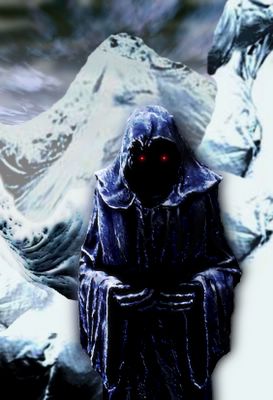
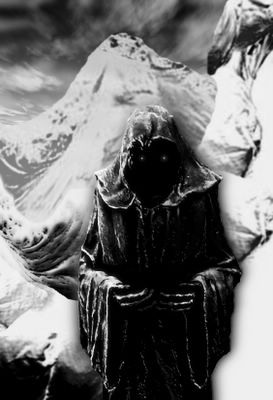
I am challenged by this part of myself, yet often I find it necessary to my survival. He holds many of my needed powers and abilities, yet his very presence is a test of endurance. The stern and exacting essence of Saturn the taskmaster. Yet, it is not hate that he brings, just intensity. I say JUST intensity, like intensity could ever be anything but INTENSE. Once I realized that it was intensity and endurance, it became easier. I understood his directness. His message bypasses all the petty illusions we construct. Like an arrow, his goes straight to the heart of the matter. This is a challenge if your eyes do not want to see the truth.
{Digital Images manipulated in Photoshop.}
Thursday, February 24, 2005
Subscribe to:
Posts (Atom)


