Showing posts with label Zombie. Show all posts

Wednesday, March 02, 2016

From the Archives: The Light Within


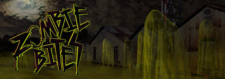
Here we have the header from October 2015 of a crowd burned through with jack-o'-lantern faces.  I wanted to do a piece for the dark season to evoke that feeling of Halloween without simply repeating the traditional imagery.   I wanted something that would give the aura of the unusual that jack-o'-lanterns posses minus the happy go lucky feeling even scary jack-o'-lanterns seem to have.  I also wanted to access that unsettling feeling when a large crowd is looking at you and only you....zombie fears activate!

For 2015, I wanted to take the headers in a different direction than the work I had been producing.  I chose to adopt a looser style.  Although the 2014 pieces all had some underlying element of dark humor or social commentary, the 2015 headers have all moved back towards the essence of the work I want to create: horror.
{13.33x4.68,  created in Adobe Photoshop}

Wednesday, July 22, 2015

From the Archives: Trick or Treat


Here we have the Zombie Bites header from October 2014, Trick or Treat.   Trick or Treaters can be a surly bunch if they don't get the candy they want.  Who knows what calamity might happen on Halloween night if a Zombie outbreak should occur.
~

During 2014, I began creating a new header each month depicting a scene associated with the dominate holiday for that month but with a zombie twist.  I'll be posting the headers here in From the Archives to give them a nice dark corner to fester in.  I'll also be posting the images with and without the logo so you can see the parts of the background image that were covered by the logo.  Thanks for viewing and reading!

If you like what you see here, be sure to check out Valentine's Day, Saint Patrick's Day, Easter, Mother's Day, Father's Day, The Horde of July, and Back to School.

{8x2.81,  created in Adobe Photoshop}

Wednesday, June 10, 2015

From the Archives: Back to School


Here we have the Zombie Bites header from August 2014, Back to School. As everyone knows, those first few days of the school year can be very challenging.  All those young minds hungry for...uhm...knowledge.  With fresh hosts all lined up in their seats, a school bus ride would be an ideal set of conditions for the zombie infection to take root.  Before the bus driver could realize what all the noise and screaming was about, it would be far too late for everyone.  The bus would quickly become a cairn for the living dead.

~

During 2014, I began creating a new header each month depicting a scene associated with the dominate holiday for that month but with a zombie twist.  I'll be posting the headers here in From the Archives to give them a nice dark corner to fester in.  I'll also be posting the images with and without the logo so you can see the parts of the background image that were covered by the logo.  Thanks for viewing and reading! 

I apologize that I am unable to post the header without the logo.  I had a computer crash back in August of 2014 and lost access to some of my files and data.  I do not currently have access to the logo-less version of this image, but as soon as I do, I will post it here. 

If you like what you see here, be sure to check out Valentine's Day, Saint Patrick's Day, Easter, Mother's Day, Father's Day, and The Horde of July.

{8x2.81,  created in Adobe Photoshop}

Wednesday, May 06, 2015

From the Archives: The Horde of July


Here we have the Zombie Bites header from July 2014, The Horde of July. As the zombie infection spread, all armed forces were called upon to defend the human race.  In the end, the soldiers were overwhelmed and reanimated as more mutilated hosts.  In the sweltering heat of summer the horde seeks out those it once sought to protect.  The horde hungers.

~

During 2014, I began creating a new header each month depicting a scene associated with the dominate holiday for that month but with a zombie twist.  I'll be posting the headers here in From the Archives to give them a nice dark corner to fester in.  I'll also be posting the images with and without the logo so you can see the parts of the background image that were covered by the logo.  Thanks for viewing and reading! 

I apologize that I am unable to post the header without the logo.  I had a computer crash back in August of 2014 and lost access to some of my files and data.  I do not currently have access to the logo-less version of this image, but as soon as I do, I will post it here. 

If you like what you see here, be sure to check out Valentine's Day, Saint Patrick's Day, Easter, Mother's Day, and Father's Day.

{8x2.81,  created in Adobe Photoshop}

Wednesday, April 15, 2015

From the Archives: Father's Day


Here we have the Zombie Bites header from the month of June 2014, Father's Day.  Who knows what happened outside to cause the cook out to go horribly awry.  What dread horror in the backyard made Daddy this way?  Mother and child are safe and hiding within the house, but for how long?  Daddy sure looks hungry.

I apologize that I am unable to post the header without the logo.  I had a computer crash back in August of 2014 and lost access to some of my files and data.  I do not currently have access to the logo-less version of this image, but as soon as I do, I will post it here.

~

During 2014, I began creating a new header each month depicting a scene associated with the dominate holiday for that month but with a zombie twist.  I'll be posting the headers here in From the Archives to give them a nice dark corner to fester in.  I'll also be posting the images with and without the logo so you can see the parts of the background image that were covered by the logo.  Thanks for viewing and reading!

If you like what you see here, be sure to check out Valentine's Day, Saint Patrick's Day, Easter, and Mother's Day.

{8x2.81,  created in Adobe Photoshop}

Friday, November 14, 2014

From the Archives: Happy Mother's Day!


This is the header from May 2014.  In this piece I again faced the challenge of the pastel / bright color palette, but luckily the mother zombie takes up a good bit of real estate in the image.  With the only light source being the window, that help neutralize things a bit.  I did enjoy leaving the happy sunshine and clouds picture mostly bright as a counter point to the horror of the implied action in this scene.


Friday, October 03, 2014

From the Archives: Happy Easter!


Here comes Peter-Cotton-Zombie shambling down the zombie trail!  Happy Eastaarrrhhhh!

Here we have the header for the month of April 2014.  My fear of people in full body mascot costumes, especially in public places, informed many of my choices within this piece.  Making the person inside a zombie and well...I'm done.  The color for this piece was fairly challenging.  In general, I'm not a big fan of pastel colors.  Dealing with those colors as my main palette and trying to maintain a sense of horror simultaneously was challenging.

Friday, September 05, 2014

From the Archives: Happy Saint Patrick's Day


Here are some delicious golden brains at the end of the rainbow.  This was the header for the month of March 2014, celebrating Saint Patty's in the Zombie Bites style!

Wednesday, August 06, 2014

From the Archives: Happy Valentine's Day


Here are some delicious sticky treats for your significant zomb-other!  This header ran for a portion of the month of February celebrating VD in the Zombie Bites style!  

Tuesday, May 13, 2014

SpartCon Post Con Part II: Zombie Bite Con Sketches

In addition to the flyers for SPARTANCON, I decided to create sketches for those who wanted them.  Here are some of the freebie zombie bite sketch business cards I was doing at the con.  I didn't have the time or cash to get printed cards so I figured I would try these to have something to give out.  There are a few missing though.  I didn't think to take photos of them until about 4 or 5 were gone.  I figured these would be a cool way to get the Zombie Bites name out there and to offer a piece of art to go with it.  Enjoy!

Wednesday, May 07, 2014

Featured Creature: In The Cities

"In the cities, the effects of the plague were much worse.  Within the massive populations of larger cities, the infection spread almost overnight.  The newly dead, enclosed within the complex networks of city infrastructures, were restricted to close quarters and did not disburse into smaller groups as in rural areas.

Wednesday, January 01, 2014

Wednesday, December 25, 2013

From The Archives: Loose Zombie Head Sketch

Here we have the last of loose zombie sketches.  Because of the size of this sketch, I had to piece it together from multiple scans.  It came through mostly okay, but there are a few patches of variation between the scans.  This piece is the last of the loose zombie sketches.


{11x17,  Graphite}

Wednesday, December 18, 2013

From the Archives: Loose Chunky Zombie

Here's another loose zombie sketch with a chunky undead emerging from some bloody chamber of horrors.  With this one I had a bit of trouble getting it scanned.  The original drawing was fairly light and on a heavier stock paper.  This sketch had been folded like several other pieces from this month and the creases were very dramatic in the scan.  I had to play around in Photoshop a bit to erase the creases.

{11x17,  Graphite}


Wednesday, December 11, 2013

From the Archives: Loose Twisting Zombie Sketch

Within this sketch, you can see that I was fighting the looseness a bit.  The essence of the loose style is present, but I don't feel that is it as successful as the slender zombie I presented last week.  I feel like the fault lies with the detail.  Although in some areas it works better than others, the arm for instance, but I feel like it flattens other areas, the legs and shoulder.  This one also belongs to the 11x17 folded set.


{11x17,  Graphite}

Wednesday, December 04, 2013

From the Archives: Loose Slender Zombie

More loose zombie goodness from some time ago.  This looser style is very visually pleasing in retrospect, but at the time I remember being frustrated with the loose shapes and lack of explicit detail.  I wish I could let go more to explore this style, I enjoy the organic quality of the shapes.  I can't imagine inking it though.  My inking process is very controlled.

This one is the first of a set of sketches I'll be posting that were done on 11x17 sketch paper.  For storage purposes I had folded the sketches and placed them in binders.  After scanning, I went back into the images in Photoshop and removed most of the fold lines, but you can still see the folds in a few places.

{11x17,  Graphite}


Wednesday, November 27, 2013

From The Archives: Loose Sketch Zombies

More loosely sketched zombies and poses this week.  With the larger portrait I brought in a fine point marker for more detail.  I usually keep my imagery very separate, but with the looseness of these sketches, the images all began to blend together.

{8x5.33,  Marker}

Wednesday, November 13, 2013

From the Archives: Zombie Profile Sketch

Here is a super loose graphite sketch of a zombie in profile.  At the time I drew this I was experimenting with a different technique from my normal style.  I was turning the pencil sideways from my regular hand position I use in an attempt to draw more loosely.

Friday, October 18, 2013

Exhumed: Reexamining the Dead


This week I'm beginning one of the new features I mentioned previously in the Featured Creature Last Bites for 2012-2013.  With Exhumed posts, I'll be digging up older pieces and exploring them with fresh color and tones.  I'll be pulling from the backlog of images I've posted on Zombie Bites, ranging from older From the Archives posts to older Featured Creature posts.  Exhumed posts will focus mainly on the process of taking a drawn image and bringing it to the next level with tones and color.  The posts will be generally infrequent, but I'll try to keep them as regular as possible.  Exhumed will be appearing on Fridays.

Wednesday, October 16, 2013

From the Archives: Moody Sketches


Here are a couple of moody developmental sketches from a zombie comic I was working on some time ago.  I was planning something grandiose at the time, but this one may still emerge as a single story.

{8x5.33 Sharpie}
Related Posts Plugin for WordPress, Blogger...