I was excited to dig into this piece with color. Originally I had imagined the energy surrounding the mask as a warm set of colors. However, as soon as I began working with color I knew that it had to be cool blues. I added the muted background because I wanted to develop the space within the piece more without detracting from the focus on the foreground entity. Looking at this now, I think this may be in the same reality, the same underworld as an earlier piece.
Showing posts with label 2006. Show all posts
Showing posts with label 2006. Show all posts
Friday, January 10, 2014
Exhumed: Identity
I was excited to dig into this piece with color. Originally I had imagined the energy surrounding the mask as a warm set of colors. However, as soon as I began working with color I knew that it had to be cool blues. I added the muted background because I wanted to develop the space within the piece more without detracting from the focus on the foreground entity. Looking at this now, I think this may be in the same reality, the same underworld as an earlier piece.
Wednesday, October 16, 2013
From the Archives: Moody Sketches
Here are a couple of moody developmental sketches from a zombie comic I was working on some time ago. I was planning something grandiose at the time, but this one may still emerge as a single story.
{8x5.33 Sharpie}
Wednesday, May 01, 2013
Wednesday, December 26, 2012
From the Archives: Emptiness
A creepy sharpie sketch from some time ago. This was a developmental sketch for a painting. After scanning the image, I did a little tweaking around the edges in Photoshop to cover up the white. The white made the cloaked figure a little hard to see. I was trying to achieve a subtle ambiguity with the darkly cloaked figure in night darkness. Where does the shadow begin and the figure end? It still needs more work, but a solid idea.
Wednesday, September 19, 2012
From The Sketchbook Archives: She Hunts at Night
Here is a quick sketch from long ago of a goblin girl. I imagine her with a singsong style of speech with very jerky body movements. I suspect she leaves a bloody mess everywhere she goes.
Her feet make me think of baba yaga's hut.
Her feet make me think of baba yaga's hut.
Wednesday, September 12, 2012
From the Sketchbook Archives: Nightboy
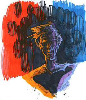
A quick sketch portrait of a nighttime denizen from some time ago. This piece illustrates the reluctance I have sometimes to completely embrace solid black shadows. It probably would have worked just as well without the hatching or the thin highlights on the neck and at the temple and hair. Once the black is applied though, it's permanent. The challenge as always is knowing when.
{Sharpie}
UPDATE 022614:
This piece was Exhumed and reinvestigated with color in February 2014. Check out the Exhumed image here.
UPDATE 022614:
This piece was Exhumed and reinvestigated with color in February 2014. Check out the Exhumed image here.
Wednesday, August 15, 2012
Wednesday, August 08, 2012
Wednesday, August 01, 2012
From the Sketchbook Archives: Demon
More Sharpie play inspired by the artwork of Mike Mignola and the ninth episode of the series The Hakkenden: The Legend of the Ghost Cat.
{Sharpie}
Tuesday, May 22, 2012
From the Sketchbook Archives: Strange Eye
Here's a quick sketch of a strange Cthulhian eye. I've always been fascinated / creeped out by octopus and squid aspects of the Cthulhian Mythos. My goal with this sketch was to explore some of the nonhuman eye construction one might encounter in the worlds of H.P. Lovecraft.
{Graphite}
UPDATE 042814:
This piece was Exhumed and reinvestigated with color in March 2014. Check out the Exhumed image here.
{Graphite}
UPDATE 042814:
This piece was Exhumed and reinvestigated with color in March 2014. Check out the Exhumed image here.
Tuesday, May 01, 2012
UPDATE Sketchbbok Archives: Taurian
 Another of the Rescans. Another interesting realization here about the differences between the ZIG and Sharpie markers. Please check out the
old post and compare.
Another of the Rescans. Another interesting realization here about the differences between the ZIG and Sharpie markers. Please check out the
old post and compare.Sunday, April 29, 2012
UPDATE Sketchbook Archives: Scream
 Another of the Rescans. When I glanced at this rescan, I didn't think there was much change between this one and the original, but once I saw the two together, there is a definite improvement! Please check out the old post and compare.
Labels:
2006,
Anger,
Dark,
Dark Arts,
Drawing,
Entity,
Illustration,
Sharpie,
Sketchbook,
Update
Saturday, April 28, 2012
UPDATE Sketchbook Archives: Red
 Another
update from the Rescans. This one is completely changed by the Rescan.
With the darkness of this piece and the glare from the sharpies, there
really was no way to get a decent shot of this one. Once again the
Scanner saves the day! Please check out the old post and compare.
Another
update from the Rescans. This one is completely changed by the Rescan.
With the darkness of this piece and the glare from the sharpies, there
really was no way to get a decent shot of this one. Once again the
Scanner saves the day! Please check out the old post and compare.Friday, April 27, 2012
UPDATE Sketchbook Archives: Face of Darkness
 Another update from the Rescans. This is one that benefits greatly from the rescan. No glare at all, in fact, you get some of the subtlety of the Sharpie transparency showing through on the scan. That almost never shows up in reproduction. Please check out the old post and compare.
Thursday, February 02, 2012
UPDATE Sketchbook Archives: Dancing Hand
Monday, January 30, 2012
From the Skechbook Archives: Sharpie Zombie
Here is the first sketch from the my recent sketchbook. At the time, I had just gotten my first taste of my new gigantic Sharpie set and wanted to play. This isn't really all that great a drawing across the board, but I wanted to include it regardless. This is me unfocused.
{Sharpie}
{Sharpie}
Wednesday, January 04, 2012
From the Sketchbook Archives: Taurian
Another Sketchbook Portrait. Once again, sorry on the crappy reproduction. Some strange half-bullheaded creature. SMUG, but man I love that orange. I have to admit that the orange is different kind of marker from the Sharpie. It is a Zig double ended marker, Clean Color. It is the most beautiful orange in a marker I have ever found.
Orange in markers usually ends up dull and listless or as a lighter clone of red, but the ZIG orange slides on smooth and covers evenly the FIRST time and is bright and full! It also solid and thick, almost like paint, but it is not a paint marker. The orange is great, but I still love Sharpie for all my other colors. :-) Vive Le Sharpie, but Hurray for Orange ZIG!
{Sharpie and ZIG}
UPDATE:
I find it interesting that in the first reproduction, the ZIG marker seems unaffected by the flash glare, but the Sharpie is blurred and desaturated. Regardless, a much better reproduction here. The lines are crisp and the color is accurate. Once again - Hooray for scanner!
While examining this piece, I think I just found a name for my scanner: Bifrost, the Norse rainbow bridge.
Wednesday, December 28, 2011
From the Sketchbook Archives: Face of Darkness
This is from one of my sketchbooks. It was inspired by an image of Randall Flagg from the television miniseries for The Stand. There is a scene where Stu is dreaming of Mother Abigail and Randall Flagg is standing in the corn. Flagg opens his eyes and they are all red and glowing - VERY Creepy! I was trying to capture that same feeling that the image from the show gave me - Creepy half light with demon fire within. Once again I must apologize for the glare. Heavy sharpie just does not photograph well at all. :-(
{Sharpie}
UPDATE:
 Another
update from the Rescans. This is one that benefits greatly from the
rescan. When photographing the original post, I discovered to my
chagrin, that heavy sharpie reflects a flash like polished silver. No
matter what position I placed the image in, I couldn't get a shot
without some kind of glare. Here that issue is completely resolved. Also, the color on this one is just fantastic. It looks exactly like the page. Have I mentioned that I love my scanner?!?
{Sharpie}
UPDATE:
 Another
update from the Rescans. This is one that benefits greatly from the
rescan. When photographing the original post, I discovered to my
chagrin, that heavy sharpie reflects a flash like polished silver. No
matter what position I placed the image in, I couldn't get a shot
without some kind of glare. Here that issue is completely resolved. Also, the color on this one is just fantastic. It looks exactly like the page. Have I mentioned that I love my scanner?!?
Another
update from the Rescans. This is one that benefits greatly from the
rescan. When photographing the original post, I discovered to my
chagrin, that heavy sharpie reflects a flash like polished silver. No
matter what position I placed the image in, I couldn't get a shot
without some kind of glare. Here that issue is completely resolved. Also, the color on this one is just fantastic. It looks exactly like the page. Have I mentioned that I love my scanner?!?Wednesday, December 21, 2011
From the Sketchbook Archives: Red
I did a whole series of sketchbook images playing with Sharpies...dark portraits from the other side. Perhaps he is a distant cousin from Hellboy's Rasputin or some denizen from the outer dark.
This is another one with reproduction issues. I couldn’t get a good shot of this one without a blur. :-( I gotta get a friggin' scanner! ARGH!
Recommended Listening:
Apoptose
Asche
Schattenmaedchen
{Sharpie}This is another one with reproduction issues. I couldn’t get a good shot of this one without a blur. :-( I gotta get a friggin' scanner! ARGH!
Recommended Listening:
Apoptose
Asche
Schattenmaedchen
 UPDATE:
 Another of the Rescans. Obviously, this one is completely changed and revealed by the Rescan. With the darkness of this piece and the glare from the sharpies, there really was no way to get a decent shot of this one. Once again the Scanner saves the day! Thank You beautiful technology...although technically technology caused the problem in the first place. Ha. Enjoy. Interesting note here is that despite the major blur, the color on this one was fairly accurate in the first piece as well. With the one exception of the glare turning the blacks red...or maybe just picking up the red beneath...hmph.
Sunday, December 11, 2011
From the Sketchbook Archives: Scream
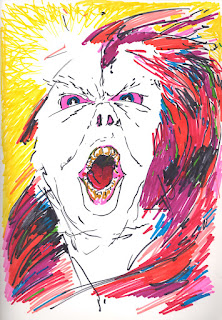
Looking back, I think this may be an indirect portrait of someone unpleasant I was working with at the time. Anger and Sharpies - cheaper than therapy I guess.
Recommended Listening:
The Prodigy
Omen
Invaders Must Die
{Sharpie}
UPDATE:
Wow. Initially I didn't there was much change between these two, but looking at them side by side I can a severe blur and glare within the original. The scan turned all the colors up a notch or two as well. I cannot say it enough - Hooray for scanner! Hmmmm...my scanner needs a name...I'll get on that. :-)
Labels:
2006,
Anger,
Dark,
Dark Arts,
Drawing,
Entity,
Illustration,
Sharpie,
Sketchbook
Subscribe to:
Posts (Atom)


